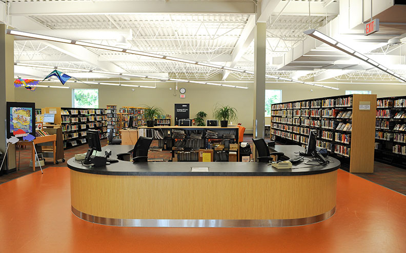
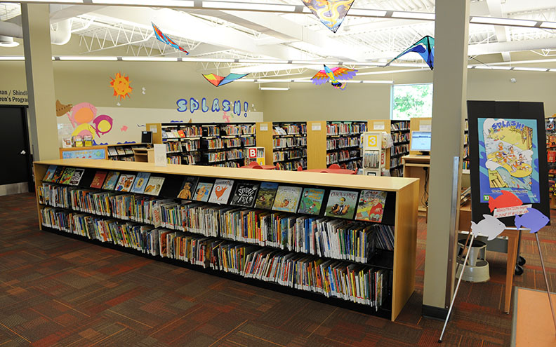
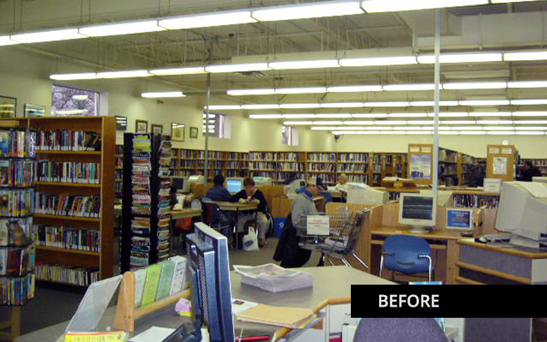
As the busiest branch in the city, Henderson Library was in real need of an expansion and renovation. See the before photo to show what it looked like before the renovation. This space was dying from being beige and worn out. Our job was to create an interior with substantial energy and flow to attract the public into the space. Our expertise in commerical interior design helped seal the deal.
Our team is adept at working within limited budgets and we knew it needed to be very innovative to pull off this project.
The existing space was being increased for a total of 18,000 square feet and the library was taking over the next tenant space. Many walls came down which meant a lot of electrical and mechanical relocations needed to be made. Synergy Interior Design Inc. acted as the prime consultant on this project and hired the other professionals including the architect and engineers.
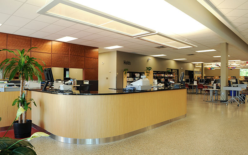
The original use of the space in this strip mall was a grocery store. Back in the day, grocery stores used terrazzo for flooring. In a smart, cost-saving strategy, we uncovered the old flooring and had it cleaned, repaired and refurbished for a new life.
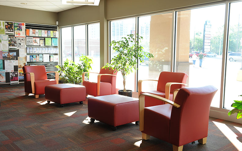
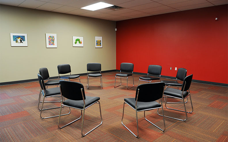
The library was reorganized to incorporate more functions like lounge seating, study tables, young adult area, and a larger kids area with an attractive and functional program room.
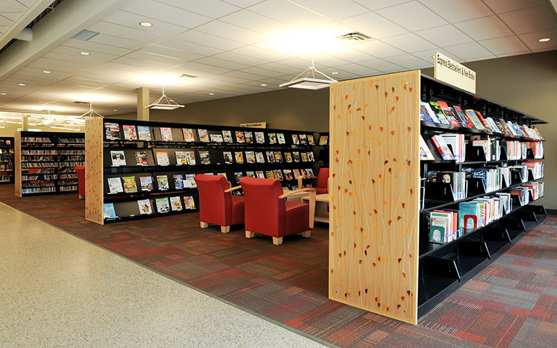
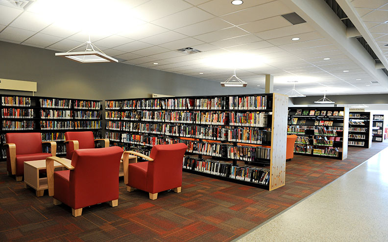
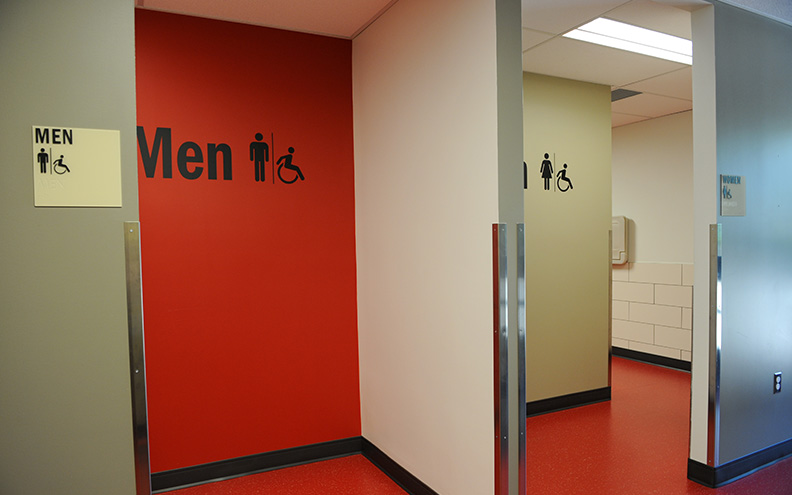
Universal design and accessibility are driving forces in public projects. For the Henderson Library, we created a new circulation desk to be accessible, a new universal toilet room was added and the stacks were lowered with larger circulation around them to accommodate wheelchairs.
New furniture standards were used with a keen eye on cleanability, use for all ages, and a more contemporary look.
The reflected ceiling plan was completely redone for better lighting in the stacks area, which is open to the metal roof deck. The remaining ceiling was tiled for cost and acoustical reasons. The more intimate spaces for reading, as well as the circulation desk, were lit with hanging pendants. This helped to stylishly accentuate the use of these spaces.
We used colour to energize the space and make it more playful to attract the public. The community responded overwhelmingly to the renovated space and this library remains the busiest branch in the city.


