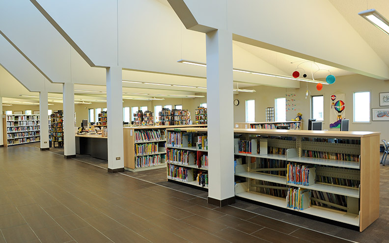
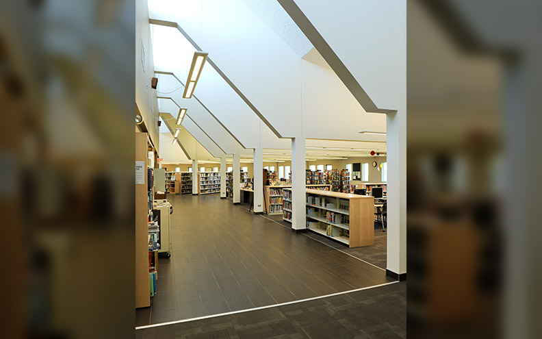
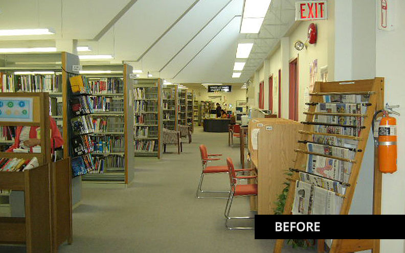
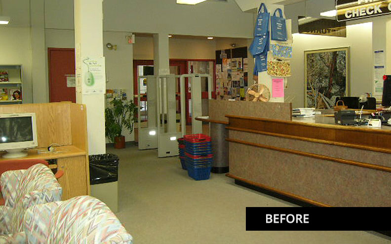
The unique building housing this library has a very distinct interior with columns and ceiling lines angling up along to the circulation area. The column spacing dictated to us the spacing of the stacks and lighting.
Synergy Interior Designs' involvement with the public space of Louis Riel Library started with the entire library being reorganized. The books that were used the least were at the front of the library and the books with the highest circulation were at the back of the space. The children’s area was located in a space that was not visible from the service desk. All this needed to change.
We reorganized the library with the highest circulation collection being fiction moving to the front of the library and the non-fiction moving to the back of the space. This limited the traffic to these areas. The children’s area was moved next to the service desk with controlled access for security reasons. The Young Adult collection and reading area was positioned next to the windows for a more private space for the teens to enjoy.
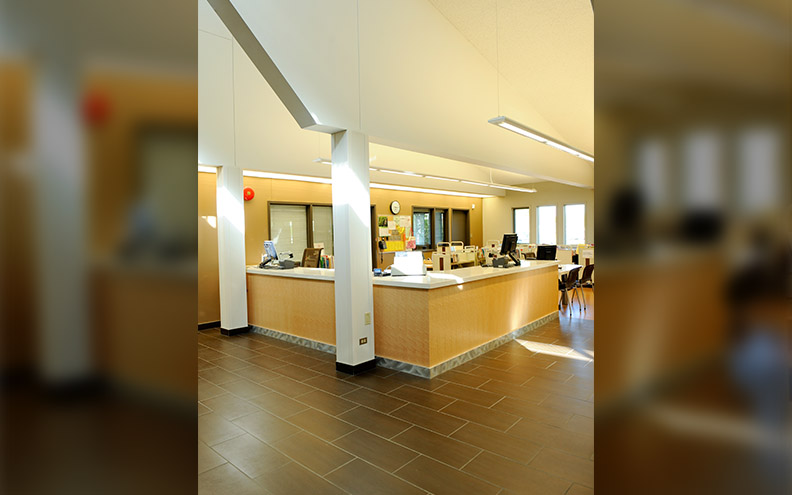
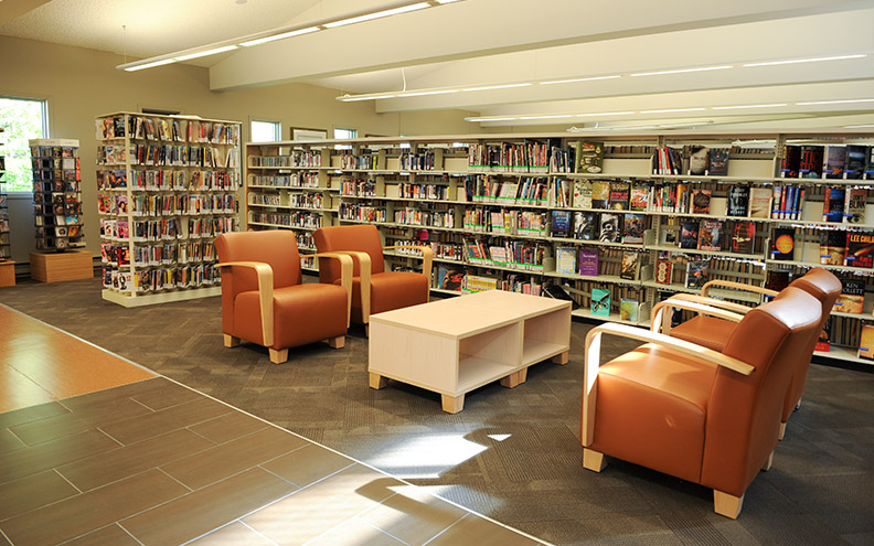
The space that greets the public when one entered the library was dated and not equipped to be accessible to the public, with security gates that were no longer in use. We opened up the space and created an accessible circulation desk and a more inviting interior. A lounge area was created adjacent to the circulation desk for the public to enjoy next to the new releases. We capitalized on the trend for library users to be more interactive, making it more attractive to take their reserved books off the holds shelf themselves and to use self-checkout.
We increased the study tables located next to the windows for more private use for reading and studying and added more lounge areas. The furniture also needed to accommodate any persons with mobility issues. This was accomplished while keeping in mind the range of ages using the library from toddlers to very senior members of the community.
The original space was over lit with fluorescent lighting due to the ceiling details and column locations. We cut the light fixture numbers by 50% with the use of LED lighting. This helped with the library's electrical budget. The new light fixtures provide both ambient and task lighting, making the space more enjoyable for the public.
The flooring was replaced with full-body porcelain tile for the main circulation areas which help to define that space with a very durable product. To define the circulation desk we used rubber floor for those with visibility issues, which is a strategy that provides a sensory signal that they are nearing a functional change. New carpet tiles were used throughout the remaining library space to resolve any acoustical issues. The colour scheme developed for this library was intended to create a warm and comfortable space for this location making it unique from other libraries in the city.


